Most savvy online marketers already know about this Google update, so this post is dedicated to people who have been too busy running their business to have noticed the memo.
Since April 21st of this year, Google launched a new update ‘mobilepocalypse’ – Meaning, if your website isn’t mobile phone friendly, your site won’t stand a chance of organic search rankings.
What you may not know, is that Google ranks websites on two different SERP’s (search engine results page), One for desktop and another for mobile phones. Meaning, a search result on a desktop will be different to a smartphone.
This may not come as a surprise to younger people, but mobile phone and tablet searches have overtaken desktop searches.
Now if you use Google webmaster tools (like I recommended in a recent post), you would have been alerted to the fact that your site is, or is not mobile friendly.
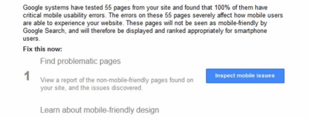
If this is news to you and you would like to check the status of your site, check this Google developers site: www.google.com/webmasters/tools/mobile-friendly/
Another way to quickly check is to go to www.mobletest.me
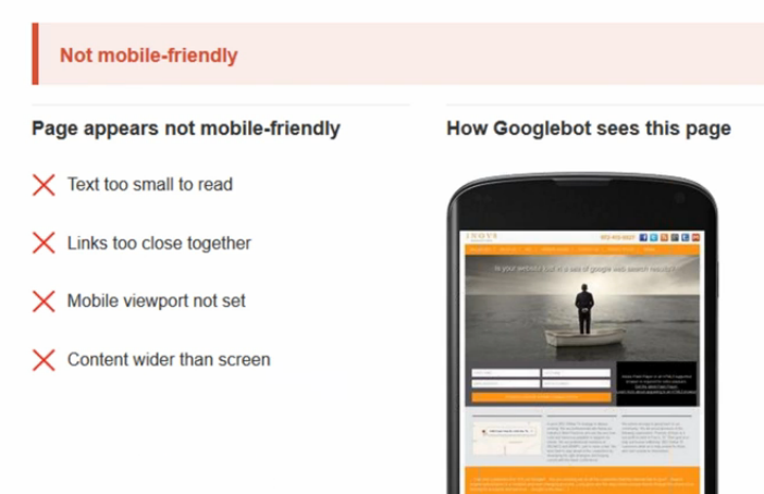
The theme of your website may be ‘mobile responsive’ – which may or may not be ‘mobile friendly’. A mobile-friendly site resizes but simplifies the site down to the most important easily clickable features (map & phone). Google wants mobile friendly. The key point to take home is that Google wants ‘mobile friendly’, so take the time to double check.
There are two simple ways you can fix this yourself. Otherwise, pay a freelancer an overpriced sum to do it for you.
The first remedy is using a plugin from WordPress. Meaning, this will not work for you if your site isn’t a wordpress website.
Search and install the plugin ‘Jetpack’. This is a very popular plugin, so you won’t have any trouble finding it. Click into it and go to ‘features menu’ > from there go to ‘mobile theme’ > then click the button that says ‘activate’. You will be taken to a Google developers page where you add your URL and click ‘analyse’.
BOOM. Your site is now mobile friendly. It’s that easy a kid from kindergarten could do it.
Many webmasters were making a killing charging a decent sum to do this service, simply doing this easy task.
If you DONT have a WordPress site then your alternative is using a service by www.dudamobile.com/
By following the simple prompts, you can have your site mobile friendly in a matter of minutes.
There is an upside and a downside to this service. The upside is that it offers a preview of what your website will look like before you switch over – giving you get many different layout options to choose from (unlike Jetpack).
The downside is that it is a paid service. But still very cheap.
So there you have it! Now you have no excuses.
Good luck with your internet marketing – and remember, you can never have enough video content for your website.